One of my goals this year was to complete our guest bathroom. It was so basic and white. The light fixture was well gross! We finally did it and we LOVE it!
Before:
I forgot to take an official before photos but this gives you the idea.
After:
We decided, for sake of not wasting what we already had, to use a grey color. Its very similar to the color in the living room but has more of a blue undertone and works much better in this room than it did in the living room. Also shown here is the art work I replicated (from one of my all time favorite blogs). So its far from perfect all the taping was done by eye-ing. But none the less I love how it turned out! I started by painting the whole canvas white covering the trees that were previously there. Well I used a roller brush that we had lying around forever. Well bad idea it kindly left behind these tiny pieces of fuzz. Learn from me and use a nice paint brush. So anyway when you look closely it has a texture look. whoops. Still love it though!
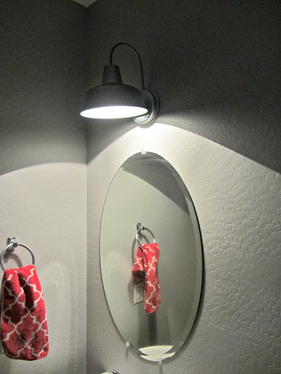
We chose this light fixture. It doesn’t give off much light but enough that is necessary. It was actually an outdoor light from Lowe’s. Neither Shawn or I liked any of the “bathroom” fixtures. We LOVE it!
Here’s a better look at it…
We picked up this magazine rack from Hobby Lobby.
The girls decided they wanted artwork in the bathroom too! I couldn’t resist and I must say it adds a cute home-y touch. Check out Adisyn’s on the right she was replicating my canvas shown above. She is just like her Mommy!
I am so happy to have this project done and for hardly any hard earned green stuff aka money. I keep walking by and peeking in to take a glance at it. Is it weird that I want to eat breakfast in there just to admire it? Just Kidding people!


1 comment:
Very cute! I think your canvas looks awesome.
Post a comment (1)